
Gallery walls have become increasingly popular in modern interior design, offering homeowners a dynamic way to showcase their favorite artwork, photographs, and memorabilia. The key to creating an impressive gallery wall lies in selecting the right combination of picture frames that complement each other while adding visual interest to your space. Whether you're displaying family photos, artwork, or unique collectibles, the choice of picture frame can dramatically impact the overall aesthetic and cohesion of your display.
Creating a stunning gallery wall requires careful consideration of frame styles, colors, and arrangements that work harmoniously together. From traditional wooden frames to contemporary acrylic options, the possibilities are endless when it comes to curating a personalized display that reflects your unique style and interests. Understanding how different frame materials, sizes, and finishes interact with each other is essential for achieving a professional-looking result.
Mixed Material Magic
Combining Wood and Metal Elements
One of the most effective approaches to gallery wall design involves mixing different frame materials to create visual texture and depth. Combining warm wooden frames with sleek metal options creates an interesting contrast that prevents your display from appearing monotonous. Consider alternating between natural wood tones and brushed silver or black metal frames to establish a sophisticated rhythm throughout your arrangement.
When selecting wooden frames, opt for varying grain patterns and finishes to add subtle variation while maintaining cohesion. Pairing rustic reclaimed wood frames with polished metal options creates an appealing industrial-meets-farmhouse aesthetic that works particularly well in contemporary living spaces. The key is maintaining a balanced distribution of materials rather than clustering all similar frames together.
Incorporating Acrylic and Glass Options
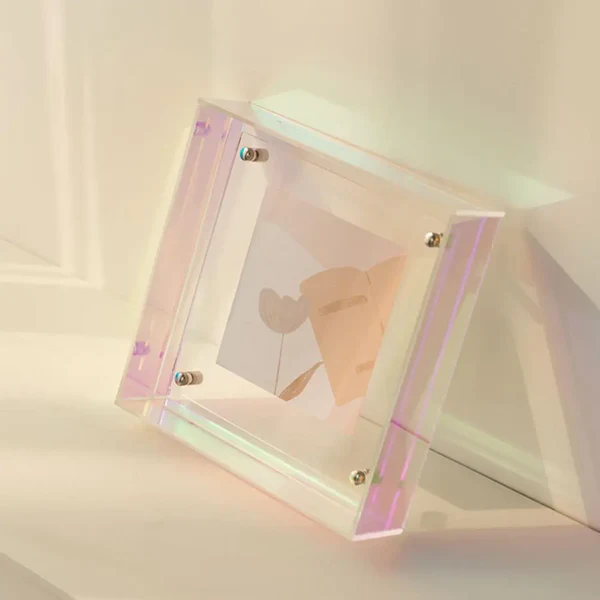
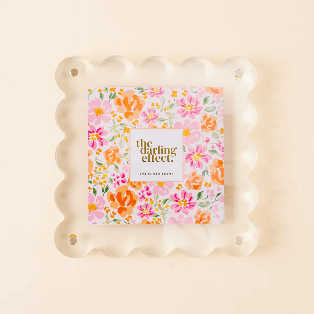
Modern gallery walls benefit greatly from the inclusion of transparent and translucent framing materials that add a contemporary edge to traditional displays. Clear acrylic frames create a floating effect that allows artwork to appear suspended on the wall, while frosted glass options provide subtle texture without overwhelming delicate pieces. These materials work exceptionally well when displaying vintage photographs or minimalist artwork.
Acrylic frames are particularly versatile because they complement virtually any color scheme while providing excellent protection for valuable pieces. Their lightweight nature makes them ideal for larger artworks or when creating extensive gallery walls that might otherwise put excessive strain on wall mounting systems. Consider using acrylic frames for pieces you want to emphasize or create focal points within your overall arrangement.
Color Coordination Strategies
Monochromatic Sophistication
Creating a monochromatic gallery wall using frames in similar color families produces an elegant and cohesive appearance that allows the artwork itself to take center stage. This approach works particularly well with black, white, or natural wood tones that provide neutral backdrops for colorful artwork or photographs. Varying the shades within your chosen color family prevents the display from appearing flat or one-dimensional.
When working with a monochromatic scheme, pay attention to different textures and finishes within your chosen color range. Matte black frames can be paired with glossy black options, while distressed white frames complement crisp white contemporary styles. This subtle variation maintains visual interest while preserving the clean, unified appearance that makes monochromatic displays so appealing.
Strategic Color Accent Integration
Introducing carefully selected color accents through your frame choices can enhance your gallery wall's visual impact while tying it into your room's overall color scheme. Choose one or two accent colors that appear elsewhere in your space, such as throw pillows, artwork, or decorative objects, and incorporate frames in these hues strategically throughout your display.
The key to successful color integration lies in restraint and strategic placement. Rather than overwhelming your gallery wall with multiple bright colors, use accent frames sparingly to create focal points and guide the viewer's eye through your arrangement. This technique works particularly well when highlighting special pieces or creating visual pathways within larger displays.
Size and Scale Considerations
Creating Dynamic Proportions
Successful gallery walls incorporate frames of varying sizes to create visual rhythm and prevent monotony. The interplay between large statement pieces and smaller complementary frames adds depth and interest to your display while accommodating artwork of different dimensions. Consider using larger frames as anchor points around which smaller pieces can be arranged.
When planning your size distribution, follow the rule of thirds by ensuring that roughly one-third of your frames are large, one-third medium, and one-third small. This proportion creates a natural hierarchy that guides the viewer's attention while maintaining visual balance. Avoid placing all large frames together or clustering small pieces in isolated areas, as this can create visual dead zones within your arrangement.
Establishing Focal Points
Every successful gallery wall needs one or more focal points that anchor the entire display and provide visual rest areas for the eye. These focal points are typically created using larger frames or unique picture frame styles that stand out from the surrounding pieces. Consider incorporating specialty display cases or three-dimensional frames for memorabilia, collectibles, or objects that require special presentation.
Position your focal points strategically throughout the gallery wall rather than concentrating them in one area. This distribution ensures that the entire display remains engaging and prevents viewers from focusing exclusively on one section. Shadow boxes and specialty display frames work particularly well as focal points because they add dimensional variety to predominantly flat arrangements.
Specialty Frame Applications
Shadow Box and Display Case Integration
Gallery walls become significantly more interesting when they incorporate three-dimensional elements alongside traditional flat artwork. Shadow boxes and display cases provide opportunities to showcase memorabilia, collections, and objects that cannot be accommodated by standard picture frames. These specialty frames add depth and tactile interest to your display while creating conversation pieces that engage viewers.
When incorporating shadow boxes into your gallery wall, ensure they complement rather than overwhelm the surrounding flat pieces. Choose shadow box frames that coordinate with your overall color scheme and material palette while providing appropriate depth for your displayed objects. Sports memorabilia, vintage collectibles, and family heirlooms work particularly well in shadow box presentations.
Floating and Ledge Frame Systems
Modern gallery walls benefit from incorporating floating frame systems that create the illusion of artwork suspended within transparent or minimal frames. These systems work exceptionally well for contemporary photography, botanical prints, and artwork that benefits from unobstructed viewing. Floating frames eliminate visual competition between the frame and artwork while providing necessary protection.
Ledge frame systems offer flexibility for those who prefer to change their displays regularly without repeatedly drilling holes in walls. These systems consist of narrow shelves that support framed pieces while allowing for easy rearrangement and updating. Consider incorporating one or more ledge sections within your gallery wall to accommodate seasonal rotations or frequently changing artwork.
Installation and Arrangement Techniques
Grid Versus Organic Layouts
The arrangement style you choose for your gallery wall significantly impacts its overall appearance and effectiveness. Grid layouts provide structure and formality that work well in contemporary spaces, while organic arrangements create more relaxed, lived-in aesthetics suitable for traditional or eclectic interiors. Consider your room's architecture and existing furnishings when deciding between these approaches.
Grid arrangements require precise measurements and consistent spacing to achieve their clean, organized appearance. Use consistent gaps between frames and align pieces carefully to maintain the geometric integrity of your design. Organic arrangements allow for more creative freedom but require careful attention to visual balance and flow to prevent the display from appearing chaotic or unplanned.
Professional Hanging Strategies
Proper installation techniques ensure your gallery wall remains secure and level while maximizing its visual impact. Begin by creating paper templates of each frame and experimenting with arrangements on the floor before committing to wall placement. This approach allows you to refine your composition without creating unnecessary holes in your walls.
Use appropriate hardware for each frame's weight and size, and consider the wall construction when selecting anchors and screws. Picture hanging strips work well for lightweight pieces, while heavier frames require substantial wall anchors or mounting into wall studs. Maintain consistent hanging heights by measuring from the floor rather than ceiling, as ceiling heights may vary throughout your space.
Maintenance and Longevity
Protecting Your Investment
Quality picture frames represent significant investments that deserve proper care and maintenance to ensure their longevity and continued beauty. Regular dusting and cleaning prevent accumulation of debris that can damage frames and artwork over time. Use appropriate cleaning products for different frame materials, avoiding harsh chemicals that might damage finishes or cause discoloration.
Protect framed pieces from direct sunlight, excessive humidity, and temperature fluctuations that can cause fading, warping, or other damage. Consider using UV-filtering glass or acrylic for valuable artwork, and rotate pieces periodically to ensure even exposure to environmental conditions. These preventive measures help maintain the appearance and value of both frames and artwork.
Seasonal Updates and Refreshes
Gallery walls benefit from periodic updates and refreshes that keep them feeling current and engaging. Consider establishing a rotation system that allows you to change certain pieces seasonally while maintaining the core structure of your display. This approach provides opportunities to showcase different collections while preventing your gallery wall from becoming stagnant.
When updating your gallery wall, focus on replacing a few key pieces rather than completely redesigning the entire arrangement. This selective approach maintains the established visual relationships while introducing fresh elements that renew interest and engagement. Document your arrangements photographically to help recreate successful compositions and track changes over time.
FAQ
What is the ideal spacing between frames in a gallery wall
The optimal spacing between frames typically ranges from 2 to 4 inches, depending on the size of your frames and the overall scale of your wall. Smaller frames can be placed closer together, while larger pieces benefit from more generous spacing. Maintain consistent gaps throughout your arrangement to create visual cohesion, and consider the viewing distance when determining spacing, as walls viewed from greater distances can accommodate closer frame placement.
How many different frame styles should I include in one gallery wall
Most successful gallery walls incorporate 2 to 4 different frame styles to maintain visual interest without creating chaos. This range allows for sufficient variety while preserving cohesion throughout the display. Focus on varying one or two elements such as material, color, or texture rather than changing everything about each frame. Remember that the artwork or photographs should remain the primary focus, with frames serving as complementary elements.
Can I mix horizontal and vertical orientations in my gallery wall
Mixing horizontal and vertical orientations adds dynamic visual interest to gallery walls and helps accommodate artwork of different dimensions. This approach creates natural rhythm and prevents the display from appearing too rigid or predictable. Aim for a balanced distribution of orientations throughout your arrangement, and use larger pieces to anchor the composition while smaller pieces fill gaps and provide transition elements between major focal points.
How do I choose frame colors that work with my existing decor
Select frame colors that either complement your existing color palette or provide strategic contrast that enhances your decor. Neutral colors like black, white, and natural wood tones work well in most settings and allow artwork to take precedence. For more adventurous approaches, choose one accent color from your room's palette and use it sparingly throughout your frame selection. Test frame colors by holding samples against your wall in different lighting conditions before making final decisions.